As mentioned above, traders could choose from various technical analysis tools to incorporate into their strategy. Below are five of the most common tools traders could use, with a detailed description of each.
Drawing tools are tools which traders could use to identify certain important aspects of their charts, such as identifying a possible trend by drawing a trend line.
There are three different types of market trends: uptrend, downtrend, and sideways trend. Each has unique characteristics that could help traders determine the current trend.
An uptrend will create consecutive higher highs and higher lows, whereas a downtrend, the price will create consecutive lower highs and lower lows. And, with a sideways trend, the highs and lows will more or less be equal to the previous highs and lows.
For a trader to confirm an uptrend, a rising trend line could be drawn by connecting at least two to three consecutive higher lows. The trend line could also be seen as a support line with possible entry points when the price bounces off this support line with a take-profit target above the previous higher high.
For a downtrend, a trader could draw a declining trend line by connecting two to three consecutive lower highs in order to confirm the trend. This trendline could be seen as a resistance line with possible entry points when the price bounces off this line, placing a take-profit target below the previous lower low.
When the market is ranging, a trader could draw two horizontal trend lines connecting a series of highs and lows; the top trend line will be a resistance level, and the bottom trend line will be a support level. We'll cover support and resistance in more detail later in this article.

Fibonacci retracement
Another popular tool used by traders is the Fibonacci retracement tool.
This tool works by having a trader choose the highest and lowest points of interest on the chart and draw the Fibonacci tool by connecting the highest point to the lowest point. In an uptrend, a trader connects the high point to the low point and vice versa in a downtrend.
Within the tool, there are six lines: the top is marked up at 100%, the bottom is at 0%, and the middle is at 50%. The remaining lines are 61.8%, 38.2%, and 23.6%.
The premise behind the Fibonacci tool is that it follows the golden ratio occurring at 61.8%, 50%, 38.2%, and 23.6%. These levels could be seen as possible support and resistance levels as well as areas of interest for possible entry points.
Theoretically, if the price retraces back towards one of these levels, it could be a possible entry point for a trader to open a buy (long) position when the market is in an uptrend, placing a take-profit target at or above the 100% level and a stop-loss below the level price retraced from.
When the market is in a downtrend, the same principle could apply, potentially opening a position at one of the levels according to the golden ratio, with a take-profit target at the 0% level and a stop-loss at the level above where the price retraced from.
Take-profit and stop-loss targets will differ for every trader according to their risk-to-reward ratio.

Chart patterns
Chart patterns and candlestick patterns fall into the category of price action trading, which is when a trader makes subjective trading decisions based on previous and current price changes.
Traders using this approach rarely use additional indicators. They prefer the 'clean' aesthetic look of a chart without any indicators, and they also prefer this because spotting specific chart or candlestick patterns could be easier.
We'll look at chart patterns first before moving over to candlestick patterns.
Chart patterns are a sequence of candlesticks forming a certain pattern, which could assist traders in making decisions on the direction of the trend, as well as possible entry points.
There are a variety of chart patterns available for traders to look at, and all of these patterns will fall into one of three categories, which are:
- Continuation patterns: Once a pattern has formed and the price breaks out of it, these patterns indicate that the market will likely continue following the current trend. Some continuation chart patterns could include channels and rectangles, pennants, flags, cups and handles, and ascending and descending triangles.
- Reversal patterns: Reversal patterns indicate the market will likely reverse from its current trend once the pattern has formed and the price breaks out of the pattern. Some reversal chart patterns could include rising and falling wedges, head and shoulders, double tops, double bottoms, triple tops and bottoms, as well as rounding tops or bottoms.
- Bilateral patterns: These patterns indicate indecision in the market, which means the trend could possibly go in either direction once the price breaks out after these patterns have been formed. The most popular bilateral cart pattern used by traders is the symmetrical triangle.

Candlestick patterns
The next aspect of price action trading is candlestick patterns, which traders could use to assist with certain aspects of chart patterns, or it could be used by itself.
Candlestick patterns illustrate a financial asset's historical price movement over a given time, with each candle providing price information in a single unit of time.
For example, on a daily time frame, each candle represents one day's price movement, while on a one-hour time frame, each candle represents one hour of price movement.
Each candle has three main parts: the body, the shadows or wicks, and the colour. Below, we've broken down each of these components into more detail:
- Body: The candle's body represents a financial asset's open and closing price in a single interval. The location of the open and closed points determines the direction of where the price is standing for that single interval. If the candle is bullish, the close will be above the open, and if the candle is bearish, the close will be below the open.
- Shadow/wick: Each candlestick often contains one or two shadows or wicks, depending on the price movement during an interval. The highest point of the shadow/wick represents the highest point price reached during an interval, while the lowest point of the shadow/wick represents the lowest point price reached during an interval. Sometimes, a candlestick could only have one shadow/wick; when this happens, depending on whether it's a bullish or bearish candle, the open or close is the same as the highest or lowest point in that interval.
- Colour: The colour of the candlestick indicates which direction the price moved for that specific interval. If the colour is white or green, it indicates bullish sentiment, meaning the price rose, whereas if the candle is black or red, it indicates bearish sentiment, meaning the price fell.

When assessing the candle, it might be best to wait for it to close; once the candle has closed, traders could get a better indication of its type. It might be better to wait for the candle to close because, during an interval, the candle can change colour multiple times as the price moves up and down.
Regarding the actual candlestick patterns, there are three different candlestick patterns traders could use: bullish candlestick patterns, bearish candlestick patterns, and continuation candlestick patterns. Let's look at these three types of candlestick patterns in more detail below:
- Bullish candlestick patterns: These patterns indicate that a possible reversal from a downtrend might be on the horizon. Some of the popular bullish candlestick patterns include hammer, inverse hammer, bullish engulfing, piercing line, three white soldiers, and morning star.
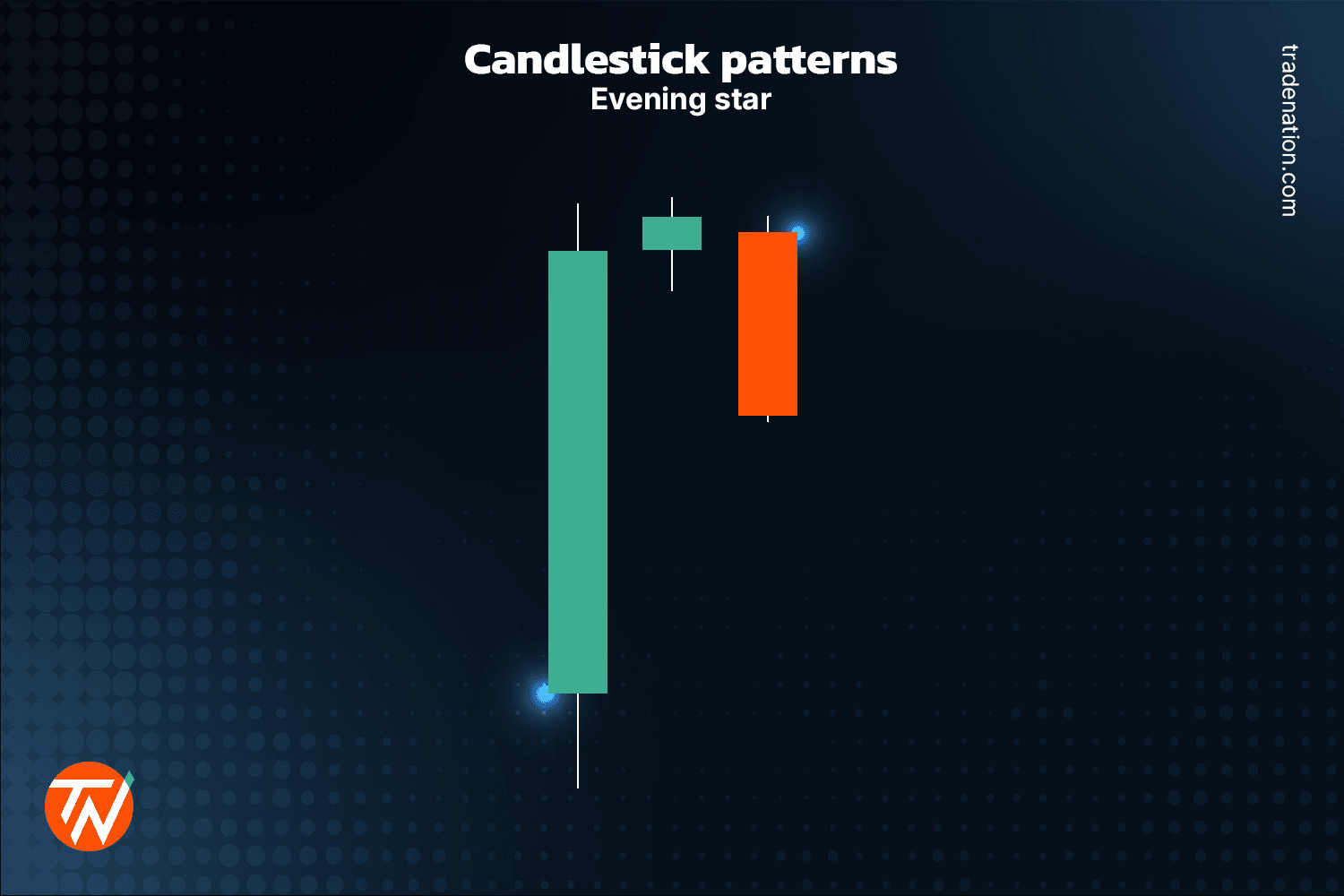
- Bearish candlestick patterns: These patterns indicate that a possible reversal from an uptrend might be on the horizon. Some of the more popular bearish candlestick patterns include hanging man, shooting star, bearish engulfing, tweezer tops, evening star, and three black crows.
- Continuation candlestick patterns: These patterns indicate indecision in the market that could see the market possibly continue with the current trend. Some popular continuation candlestick patterns include doji, spinning tops, and the falling and rising three methods.
It might be essential to remember that the market is still unpredictable, even if one of these different types of candlestick patterns appears, especially when the market is highly volatile. These candlestick patterns are only meant to assist traders with their market analysis.

Support and resistance
Support and resistance levels show how supply and demand play out in the market. These levels form over time when the market is ranging, and the price repeatedly bounces off, failing to break above or below specific highs and lows.
Support levels are formed by price retesting the previous low points, failing to break below the previous low. At the same time, resistance zones are formed when the price retests the previous high points, failing to break above previous highs.
Generally, in these market conditions, the price might move down to support (demand) levels and reverse to the upside, whereas when the price moves towards the resistance (supply) levels, the price could reverse to the downside.
Traders looking at support and resistance levels could open a long (buy) position when the price reaches support, placing a potential stop-loss order some distance below the support level with a potential take-profit target around resistance.
Similarly, when traders are looking to open a short (sell) position, they could look at entering when the price reaches the resistance level, placing a potential stop-loss order some distance above the resistance level with a potential take-profit target at support.
In some cases, the price could break one of these levels; when a breakout happens above resistance, it becomes future support, and when it happens at support, it becomes future resistance.


