2 May 2024 - 20min Read

Technical analysis & fundamentals

Technical analysis what it is and how to use it in trading

Traders use Technical analysis to identify current market conditions and future price movements by looking at historical price data on a chart.

There are certain statistics traders could use, such as price movement and volume, to provide them with an indication of market sentiment.

With this form of analysis, many traders use technical indicators and charting analysis to look for potential trading opportunities as well as entry and exit points in the market.

In this article, we'll provide an in-depth overview of various aspects of technical analysis, such as what it is, different analysis tools, and different technical indicators.

TABLE OF CONTENTS

Key takeaways

  • Technical analysis involves looking at historical price data, identifying current market conditions, and predicting future price movements.
  • Theoretically, markets tend to repeat themselves regarding certain factors, such as chart and candlestick patterns, as well as support and resistance levels.
  • Technical analysis traders don't tend to focus on fundamental aspects as they believe all the necessary information is already available on the charts.
  • There are various tools traders could use with technical analysis, such as drawing tools, Fibonacci retracement, chart patterns, candlestick patterns, and support and resistance levels.
  • There are also various indicators such as moving averages, MACD, Relative Strength Index (RSI), and Stochastic Oscillator.
  • Technical analysis traders use different time frames to do their analysis and look for entry and exit points, which could include 5-minute, 15-minute, hourly, 4-hour, and daily time frames.

Marc Aucamp

Content Writer

Liked this article? Share now on socials

What is technical analysis?

Technical analysis involves predicting future price movements and identifying possible trading opportunities and possible entry and exit points by looking at historical price data and statistics.

Technical analysts believe that the market isn't random and tends to repeat itself over time by creating identifiable, yet not identical, patterns which traders could look at to predict future price movements and find possible trading opportunities.

They generally don't focus on the fundamental aspects as they believe all the necessary information about a financial asset is available on their charts. This is why technical analysts rely solely on their charts, using various technical tools and indicators to try and identify these possible future trends and patterns.

In the next section, we'll look at some of these technical analysis tools and how traders could use them with their overall analysis.

Technical analysis tools

As mentioned above, traders could choose from various technical analysis tools to incorporate into their strategy. Below are five of the most common tools traders could use, with a detailed description of each.

Drawing tools

Drawing tools are tools which traders could use to identify certain important aspects of their charts, such as identifying a possible trend by drawing a trend line.

There are three different types of trends in a market: uptrend, downtrend, and sideways trend, each with its own unique characteristics which could help traders determine what trend the market is currently in.

An uptrend will create consecutive higher highs and higher lows, whereas, with a downtrend, the price will create consecutive lower highs and lower lows. And, with a sideways trend, the highs and lows will more or less be equal to the previous highs and lows.

For a trader to confirm an uptrend trend, a rising trend line could be drawn by connecting at least two to three consecutive higher lows. The trend line could also be seen as a support line with possible entry points when the price bounces off this support line with a take-profit target above the previous higher high.

For a downtrend, a trader could draw a declining trend line by connecting two to three consecutive lower highs in order to confirm the trend. This trendline could be seen as a resistance line with possible entry points when the price bounces off this line, placing a take-profit target below the previous lower low.

When the market is ranging, a trader could draw two horizontal trend lines connecting a series of highs and lows; the top trend line will be a resistance level, and the bottom trend line will be a support level. We'll cover support and resistance in more detail later in this article.

Drawing tools demonstrated

Fibonacci retracement

Another popular tool used by traders is the Fibonacci retracement tool.

This tool works by having a trader choose the highest and lowest points of interest on the chart and draw the Fibonacci tool by connecting that highest point to the lowest point. In an uptrend, a trader connects the high point to the low point and vice versa in a downtrend.

Within the tool, there are six lines: the top is marked up at 100%, the bottom is at 0%, and the middle is at 50%. The remaining lines are 61.8%, 38.2%, and 23.6%.

The premise behind the Fibonacci tool is that it follows the golden ratio occurring at 61.8%, 50%, 38.2%, and 23.6%. These levels could be seen as possible support and resistance levels as well as areas of interest for possible entry points.

Theoretically, if the price retraces back towards one of these levels, it could be a possible entry point for a trader to open a buy (long) position when the market is in an uptrend, placing a take profit target at or above the 100% level and a stop-loss below the level price retraced from.

When the market is in a downtrend, the same principle could apply, potentially opening a position at one of the levels according to the golden ratio with a take profit target at the 0% level and a stop-loss at the level above where the price retraced from.

Take-profit and stop-loss targets will differ for every trader according to their risk-to-reward ratio.

Fibonacci retracement explained

Chart patterns

Chart patterns and candlestick patterns fall into the category of price action trading, which is when a trader makes subjective trading decisions based on previous and current price changes.

Traders using this approach rarely use any additional indicators as they prefer the 'clean' aesthetic look of a chart without any indicators. They also prefer this because spotting specific chart or candlestick patterns could be easier.

We'll look at chart patterns first before moving over to candlestick patterns.

Chart patterns are a sequence of candlesticks forming a certain pattern, which could assist traders in making decisions on the direction of the trend as well as possible entry points.

There are a variety of chart patterns available for traders to look at, and all of these patterns will fall into one of three categories, which are:

  • Continuation patterns: These patterns indicate the market will likely continue going with the current trend once the pattern has formed and the price breaks out of the pattern. Some continuation chart patterns could include channels and rectangles, pennants, flags, cups and handles, as well as ascending and descending triangles.
  • Reversal patterns: Reversal patterns indicate the market will likely reverse from its current trend once the pattern has formed and the price breaks out of the pattern. Some reversal chart patterns could include rising and falling wedges, head and shoulders, double tops, double bottoms, triple tops and bottoms, as well as rounding tops or bottoms. 
  • Bilateral patterns: These patterns indicate indecision in the market, which means the trend could possibly go in either direction once the price breaks out after these patterns have been formed. The most popular bilateral cart pattern used by traders is the symmetrical triangle.

Chart patterns explained

Candlestick patterns

The next aspect of price action trading is candlestick patterns, which traders could use to assist with certain aspects of chart patterns, or it could be used by itself.

Candlestick patterns illustrate a financial asset's historical price movement over a given time, with each candle providing price information in a single unit of time. 

For example, on a daily time frame, each candle will represent one day's price movement, while on a 1-hour time frame, each candle will represent one hour of price movement.

Each candle has three main parts: the body, the shadows or wicks, and the colour. Below, we've broken down each of these components into more detail:

  • Body: The candle's body represents a financial asset's open and closing price in a single interval. The location of the open and closed points determines the direction of where the price is standing for that single interval. If the candle is bullish, the close will be above the open, and if the candle is bearish, the close will be below the open.
  • Shadow/wick: Each candlestick often contains one or two shadows or wicks, depending on the price movement during an interval. The highest point of the shadow/wick represents the highest point price reached during an interval, while the lowest point of the shadow/wick represents the lowest point price reached during an interval. Sometimes, a candlestick could only have one shadow/wick; when this happens, depending on whether it's a bullish or bearish candle, the open or close is the same as the highest or lowest point in that interval.
  • Colour: The colour of the candlestick indicates which direction the price moved to for that specific interval. If the colour is white or green, it indicates bullish sentiment, meaning the price rose, whereas if the candle is black or red, it indicates bearish sentiment, meaning the price fell.

Candlestick patterns demonstrated and explained

When assessing the candle, it might be best to wait for it to close; once the candle has closed, traders could get a better indication of its type. It might be better to wait for the candle to close because, during an interval, the candle can change colour multiple times as the price moves up and down.

Regarding the actual candlestick patterns, there are three different candlestick patterns traders could use: bullish candlestick patterns, bearish candlestick patterns, and continuation candlestick patterns. Let's look at these three types of candlestick patterns in more detail below:

  • Bullish candlestick patterns: These patterns indicate a possible reversal from a downtrend might be on the horizon. Some of the popular bullish candlestick patterns include hammer, inverse hammer, bullish engulfing, piercing line, three white soldiers, and morning star.
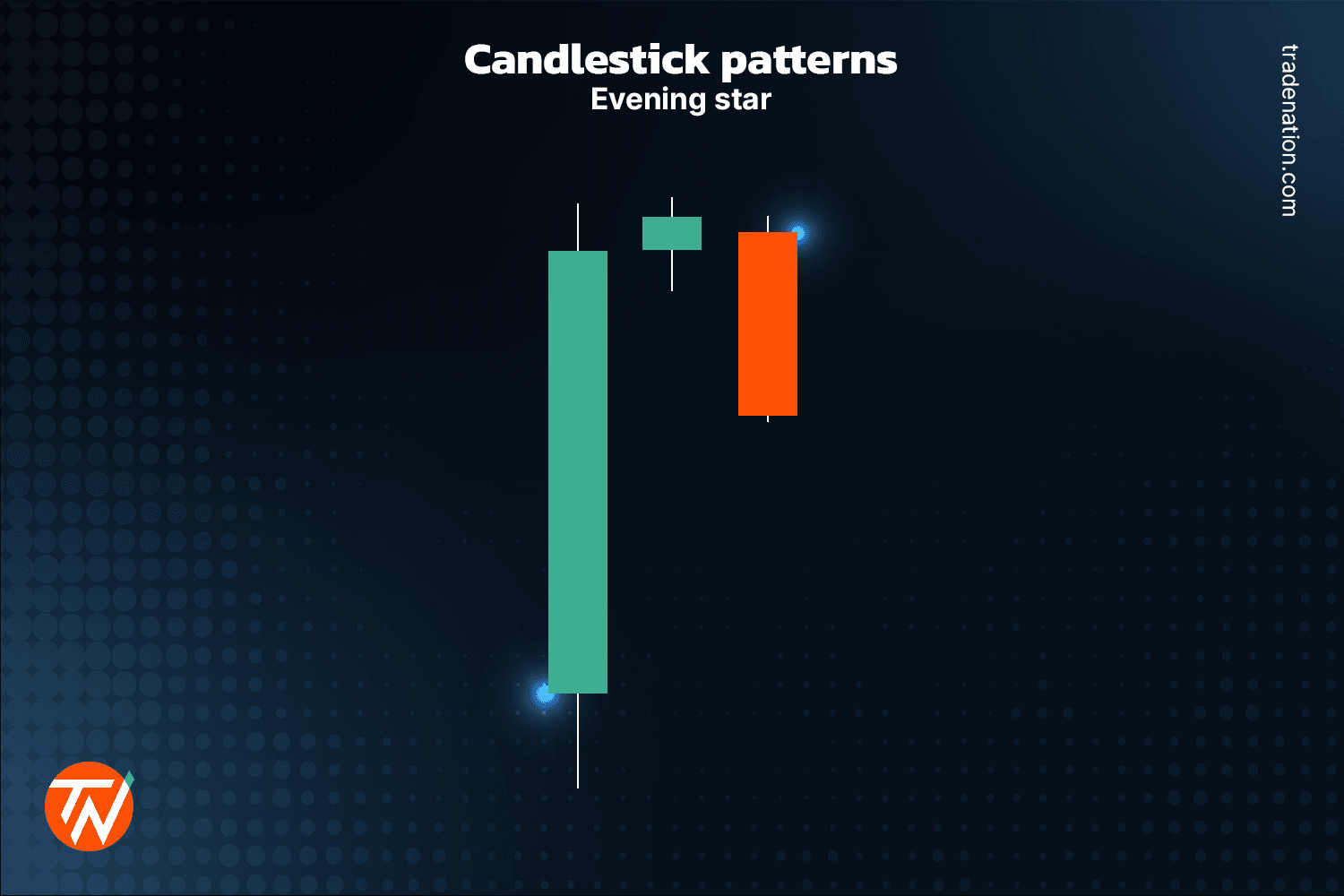
  • Bearish candlestick patterns: These patterns indicate a possible reversal from an uptrend might be on the horizon. Some of the more popular bearish candlestick patterns include hanging man, shooting star, bearish engulfing, tweezer tops, evening star, and three black crows.
  • Continuation candlestick patterns: These patterns indicate indecision in the market that could see the market possibly continue with the current trend. Some popular continuation candlestick patterns include doji, spinning tops, and the falling and rising three methods.

It might be essential to remember that the market is still unpredictable even if one of these different types of candlestick patterns appears, especially when the market is highly volatile. These candlestick patterns are only meant to assist traders with their market analysis.

candlestick patterns evening star example in technical analysis

Support and resistance

Support and resistance levels show how supply and demand play out in the market. These levels form over time when the market is ranging, and the price repeatedly bounces off, failing to break above or below specific highs and lows.

Support levels are formed by price retesting the previous low points in price, failing to break below the previous low. At the same time, resistance zones are formed when the price retests the previous high points, failing to break above previous highs.

Generally, in these market conditions, the price might move down to support (demand) levels and reverse to the upside, whereas when the price moves towards the resistance (supply) levels, the price could reverse to the downside.

Traders looking at support and resistance levels could open a long (buy) position when the price reaches support, placing a potential stop-loss order some distance below the support level with a potential take-profit target around resistance.

Similarly, when traders are looking to open a short (sell) position, they could look at entering when the price reaches the resistance level, placing a potential stop-loss order some distance above the resistance level with a potential take-profit target at support.

In some cases, the price could break one of these levels; when a breakout happens above resistance, it becomes future support, and when it happens at support, it becomes future resistance.

Support and resistance in trading explained

The markets are moving.

Start trading now.

Get startedarrow-icon
arrow-icon

Technical indicators

Technical indicators can also be seen as mathematical calculations which traders could use to identify whether the price of a financial asset has reached its peak and is likely to go down or has reached its lowest point and is likely to go up.

Traders look at information such as past price movements, trading volume, and other market data to predict where they think the price might be going.

There are many indicators that traders could use in their technical analysis; however, below, we’ve included four popular technical indicators with a detailed overview of each.

Moving averages

Moving averages are one of the most used technical indicators. This indicator takes the closing price data of a financial asset over a certain period of time and presents it as a single moving line.

So, if we look at the 100-day moving average, it takes the closing price of the last 100 days, adds the prices up, and divides it by 100 to get an average price range. The data will then be assembled and presented in a single line to give traders a better overview of the overall trend movement.

Moving averages are known as lagging indicators, meaning they only assist traders in confirming the trend and not identifying it. 

In theory, traders could use moving averages by looking at where the price is in relation to where the moving averages are. If the moving averages are above the price, it indicates the market is in a downtrend. If the moving averages are below the price, it indicates the market is in an uptrend.

The most common strategy to use with the moving averages is the crossover strategy, which is when two moving averages crossover, signalling a possible trend reversal. There are two different types of crossovers that could occur; one is known as the golden cross, which happens when the 50 MA crosses above the 100 MA, for example, signalling a possible change in the direction of the trend towards the upside.

The second one is known as the death cross, which happens when the 50 MA crosses below the 100 MA, signalling a possible change in the direction of the trend towards the downside.

Traders could incorporate certain candlestick patterns, such as the bullish or bearish engulfing pattern, with the moving averages crossovers for potentially further confirmation on entry points.

Moving averages in trading explained

MACD

The Moving Average Divergence Convergence (MACD) indicator is a popular momentum oscillator traders use to identify possible market trends and price movements.

The MACD indicator has three components: the MACD line, the signal line, and the histogram. The MACD line is comprised of two exponential moving averages over two different time periods; one is calculated over a short time frame, usually a 12 EMA and the second one is longer, usually a 26 EMA.

The MACD line is then calculated by subtracting the 12 EMA from the 26 EMA.

The second line is the signal line, which is a standard 9-period EMA of the MACD line.

The third component is the histogram, which can be seen as a visual record of movements between the MACD and signal lines. The way it works is when the MACD line is above the signal line, the colour of the histogram will appear green, indicating bullish momentum.

Conversely, when the MACD line is below the signal line, the colour of the histogram will appear red, indicating bearish momentum.

The stronger the market momentum, the higher the bars will become.

Theoretically, when the MACD line crosses above the signal line, this could be a possible indication the market is about to turn bullish with the price going to rise. Meanwhile, if the MACD line crosses below the signal line, it could indicate the market is about to turn bearish with the price going to fall.

Moving averages divergence convergence explained

Relative Strength Index

The Relative Strength Index (RSI) is another popular momentum oscillator indicator that traders could use to identify areas where the price could be seen as overbought or oversold.

Within this indicator, there is a solid line moving between a range spanning from 0 – 100, with two horizontal lines, one at 70 and the other at 30.

The way traders use this indicator, as theory suggests, is if the solid line is above the 70 level, the traded financial instrument is considered to be overbought, which could be a signal a possible reversal towards the downside is on the horizon.

Meanwhile, if the solid line is moving below the 30 level, the financial asset is considered oversold, indicating a possible reversal towards the upside on the horizon.

Relative strength index demonstrated

Stochastic Oscillator

The Stochastic Oscillator is a popular momentum indicator that traders could use, much like the RSI, to try and identify areas where price could be seen as overbought or oversold. This indicator works by taking the most recent closing price and comparing it to the previous trading range over a period of 14 days.

Apart from being a momentum indicator, it’s also classified as a leading indicator because market momentum generally changes ahead of volume or price.

This indicator is generally used in ranging markets, which, as we saw earlier, is a market where the price tends to reverse after failing to break above or below the extreme highs or lows of the previous range.

Within this indicator, there are two moving lines: the first is the indicator line, generally presented as a solid white line, and the second is the signal line, generally presented as a solid red line, as seen in the picture below.

These two lines move between two horizontal lines ranging between 0 – 100. The first horizontal line is marked at the 80 level, and the second one is marked at the 20 level.

Theoretically, if the price indicator and signal line are above the 80 level, the price is seen as overbought. Conversely, if the indicator and signal line are moving below the 20 level, the price is seen as oversold.

Another way traders could use this indicator is by trying to identify possible reversals in the market when the indicator and signal lines cross over each other.

When the indicator line crosses below the signal line at or below the 80 level, it could indicate that a possible reversal towards the downside might be coming. 

Whereas, if the indicator line crosses above the signal line at or below the 20 level, it could indicate that a possible reversal towards the upside might be coming.

Stochastic oscillator demonstrated

Role of time frames in technical analysis

Technical traders are known to use various time frames when doing their analysis, looking to identify areas of interest and entry and exit points in the market. It doesn’t matter if individuals are day traders, swing traders, scalpers, investors, institutions, or others contributing to market activity; they could benefit from using different time frames in their analysis.

This is because most technical traders could choose to use a higher time frame to get a broader overview of the market trend and then move down to a smaller time frame to look for potential opportunities and also entry and exit points. Some more popular time frames include 5 minutes, 15 minutes, hourly, 4 hours, and daily.

In theory, the smaller time frames always follow the higher time frame trend, which is why most traders choose to analyse the overall trend on the higher time frame first and then move on to looking for opportunities.

Advantages of technical analysis

Technical analysis has many advantages for traders looking to incorporate this into their trading. Let’s take a closer look at what some of those advantages are:

  • Technical analysis is generally objective, meaning traders have a set of rules to make informed decisions on possible trading opportunities in the market by looking at various indicators, candlestick patterns, and chart patterns without relying on their emotions.
  • It focuses only on price data available on the charts, which could be analysed quicker than fundamental analysis, which requires traders to read up on news events and financial reports.
  • Technical analysis could be done on various financial markets, allowing traders more portfolio diversification.
  • It could provide a clearer entry and exit point for traders using various technical indicators as well as chart and candlestick patterns.

Disadvantages of technical analysis

There are also various disadvantages involved with technical analysis, which traders might want to remember. Let’s have a look at what some of these disadvantages are:

  • The markets are constantly changing, and just because a pattern worked the first time, there is no guarantee that it work the second time because no one knows exactly in which direction the market will move. 
  • These patterns and indicators only assist traders in making predictions on where they think the market might be going, which is why the possibility of false signals is always present with technical analysis.
  • Technical traders don’t necessarily look at fundamental factors, which could limit their trading opportunities when important economic or news events are released.
  • Indicators, charts, and candlestick patterns aren’t immune to false signals because, as previously mentioned, the market is unpredictable.

Technical analysis vs fundamental analysis

Technical and fundamental analysis are the two most popular forms of market analysis. As previously mentioned, technical analysis involves looking at historical price data and making informed trading decisions. 

Together with the historical price data, traders incorporate technical indicators and various chart and candlestick patterns.

Fundamental analysis is the complete opposite, which involves looking at various economic factors to measure the intrinsic value of a financial instrument.

Certain economic factors could include economic events, news events, earnings reports, retail sales figures, employment data, and inflation reports, to name a few.

Even though these two forms of analysis are seen as complete opposites, they could also be combined to better understand the market’s current condition while trying to predict future price movements.

The way to combine technical and fundamental analysis is by looking at the intrinsic value of a financial instrument. They could then use technical indicators to look for various trading opportunities and entry and exit points in the market.

Why is technical analysis important?

Technical analysis could assist traders in identifying possible trading opportunities as well as entry and exit points by looking at the historical price data of a financial asset. 

For most traders, when they just start, the markets could become an emotional experience, with many traders falling into the trap of trading on their gut feeling, over trading, or revenge trading.

Technical analysis could assist traders in cutting out these emotional aspects of trading while providing them with the ability to gain discipline by following the tools and strategies capable of evaluating the market according to certain factors stipulated in a trader’s strategy.

This form of analysis is arguably one of the most adaptable market study methods. 

Technical indicators and tools can be used on all different charts, such as line charts, bar charts, or candlestick charts. However, most traders always prefer the candlestick charts because of the information that one candlestick can provide a trader.


People also asked

/

Technical analysis works on the basis of looking for specific trading opportunities and entry and exit points by looking at historical data and certain statistics, such as price movement and trading volume, to gain a better overview of the market sentiment.
Traders could incorporate various technical tools and indicators to provide more information a trader might need to make trading decisions.

/

With technical analysis, traders could analyse any financial markets that have historical price data available; some of the more popular markets include;
Forex
Commodities
Stocks
Indices
Technical analysis is generally more prevalent in short-term trading with highly liquid markets, which is why many traders might focus on the forex market due to its high trading volume and regular price fluctuations.

/

Technical analysis can be approached in two ways:
Top-down: Traders use this strategy to choose an appropriate investment by monitoring trade patterns ranging from major indices to sector–specific and regular interval charts.
Bottom-up: Analysts employ this method to try and identify entry and exit points for potential investments by focusing on discounted shares while ignoring the overall market trend.

Suggested articles

See allarrow-icon
arrow-icon

Gain the edge

Sign up and unlock early
access to exclusive trading
insights and educational tips.

You're signed up

Best decision you've made all week!

Something isn't right

Let's try that again

I confirm I am 18 years old or above.

By signing up to hear from us, you agree to our terms and privacy policy.

Please keep me updated on Trade Nation’s sponsorships, news, events and offers.

The markets are moving.

Start trading now.

Get startedarrow-icon
arrow-icon

Trade on our
award-winning
platform


en-sc

Payment methods

Visa card payment method
Mastercard payment method
Skrill payment method
Neteller payment method
Ngan Luong payment method

Trade on

Regulatory bodies

    UK - FCA

    Australia - ASIC

    Seychelles - FSA

    Bahamas - SCB

    South Africa - FSCA

Customer support

Sponsors of your favourite teams

The legal stuff

© 2019-2024 Trade Nation. All Rights Reserved